Plugin Development: Context Panels
Previous Section: Extending Templates
A context panel is a collapsible panel that appears within the context sidebar on the right-hand side of the operator panel.
Each registered panel gets an icon button in a vertical strip on the far right of the screen. Clicking an icon button opens the corresponding panel; clicking it again closes it. Multiple plugins can register their own context panels independently, and the operator's open/closed state is remembered in the browser via cookies.
Context panels are well suited to showing supplementary information or actions relevant to the current page, without taking up permanent space in the main content area. For example, time tracking information and actions in the ticket view, or client information from your billing system.
Panel HTML Structure
Each panel must be wrapped in a div with the class sp-sidebar-panel and a unique
data-context-id attribute.
<div class="sp-sidebar-panel" data-context-id="hello-world">
    <div class="sp-sidebar-panel-header">
        <div class="sp-icon" title="Hello World">
            <i class="fa-solid fa-globe"></i>
        </div>
        <h3>Hello World</h3>
    </div>

    <div>
        <!-- Panel content -->
    </div>
</div>
Below are the attributes that can be set on the sp-sidebar-panel element.
| Attribute | Required | Description |
|---|---|---|
data-context-id |
Yes | A unique string identifier for the panel. Used by the JavaScript API and for persisting the open/closed state in the browser cookie. |
data-context-status |
No |
Sets a small coloured dot on the tab button to indicate a status at a glance. Accepted values:
green, orange, red, blue, gray.
Can be changed at runtime using updateContextStatus().
|
data-context-open |
No | When present, this panel will be opened automatically if the operator has no previously saved state for the context sidebar (e.g. on their first visit). It will be ignored if another panel loaded earlier in the page also carries this attribute. |
Each panel should include a .sp-sidebar-panel-header containing a .sp-icon and a title
(h3). The icon is used for the context tab button, and its title attribute is used as the
tab tooltip.
You can optionally add the sp:hidden class to the panel to hide it (and its tab button) on initial
render. This is useful when a panel should only appear in certain situations; use
showContextPanel() to reveal it dynamically.
Registering the Hook
Context panels are injected via the operator.context_panel view hook, which fires on every operator
page. If the panel should only appear on specific pages, combine it with a view composer to scope it more precisely.
The example below limits the panel to the ticket view and passes the ticket model into the template:
// Only show the panel when viewing a ticket.
\View::composer('operator.*.ticket.ticket', function ($view) {
    \View::hook('operator.context_panel', function () use ($view) {
        return \TemplateView::operator('Plugins#HelloWorld::ticket.context_panel')
            ->with(['ticket' => $view->ticket])
            ->render();
    });
});
If the panel should appear on every operator page, register the hook directly without a view composer:
\View::hook('operator.context_panel', function () {
    return \TemplateView::operator('Plugins#HelloWorld::context_panel')->render();
});
JavaScript API
The following functions are available globally once sidebar.js has loaded. Because
sidebar.js is included after the scripts_footer block in the base template, any
JavaScript that calls these functions should be placed in the operator.body_end view hook.
Update Context Status
updateContextStatus(contextId, status)
Updates the status indicator dot on the panel's tab button.
// Show an orange dot.
updateContextStatus('hello-world', 'orange');

// Remove the status indicator.
updateContextStatus('hello-world', null);
Accepted values: green, orange, red, blue, gray, or null (removes the indicator).
Show Context Panel
showContextPanel(contextId, activate)
Makes a previously hidden panel and its tab button visible. If activate is true, the
panel is also opened immediately.
// Show the panel tab button, and open it straight away.
showContextPanel('hello-world', true);

// Show the tab button only; leave the panel closed.
showContextPanel('hello-world', false);
Hide Context Panel
hideContextPanel(contextId)
Hides a panel and its tab button. If no other panels remain active after hiding, the context sidebar itself will collapse.
hideContextPanel('hello-world');
Remove Context Panel
removeContextPanel(contextId)
Completely removes a panel and its tab button from the DOM.
removeContextPanel('hello-world');
Full Example
The following shows a minimal but complete context panel for a plugin. It registers the panel on the ticket view, sets an initial status indicator from server-side data, and demonstrates clearing the status and hiding the panel dynamically with buttons.
First, register the hook in your service provider:
\View::composer('operator.*.ticket.ticket', function ($view) {
    \View::hook('operator.context_panel', function () use ($view) {
        return \TemplateView::operator('Plugins#HelloWorld::ticket.context_panel')
            ->with(['ticket' => $view->ticket, 'active' => true])
            ->render();
    });

    \View::hook('operator.body_end', function () {
        return \TemplateView::operator('Plugins#HelloWorld::ticket.scripts_footer')
            ->render();
    });
});
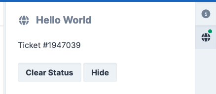
The context panel view (Views/ticket/context_panel.twig):
<div class="sp-sidebar-panel"
     data-context-id="hello-world"
     {% if active %}data-context-status="green"{% endif %}>

    <div class="sp-sidebar-panel-header">
        <div class="sp-icon" title="{{ Lang.get('Plugins#HelloWorld::lang.hello_world') }}">
            <i class="fa-solid fa-globe"></i>
        </div>
        <h3>{{ Lang.get('Plugins#HelloWorld::lang.hello_world') }}</h3>
    </div>

    <div>
        <p>Ticket #{{ ticket.number }}</p>
        <button class="sp-button hello-world-clear-status">Clear Status</button>
        <button class="sp-button hello-world-hide">Hide</button>
    </div>
</div>
Then use the operator.body_end view hook to include the JavaScript. Because
sidebar.js loads after scripts_footer, wrapping in
$(function () { ... }) ensures the API functions are available:
<script>
$(function () {
    var contextId = 'hello-world';

    // Set the initial status indicator based on server-side state.
    if (typeof updateContextStatus === 'function') {
        updateContextStatus(contextId, 'green');
    }

    // Load panel data once, either immediately (if already open) or on first click.
    var loaded = false;
    var $contextPanel = $('.sp-sidebar-panel[data-context-id="' + contextId + '"]');
    var $contextBtn = $('.sp-context-sidebar-tab-btn[data-context-target="' + contextId + '"]');

    function loadPanelData() {
        if (loaded) {
            return;
        }

        loaded = true;
        // Perform any lazy-loading here (e.g. an AJAX call to fetch data).
    }

    if ($contextPanel.hasClass('sp-sidebar-panel-active') || $contextBtn.hasClass('sp-sidebar-panel-active')) {
        loadPanelData();
    } else {
        $contextBtn.one('click', loadPanelData);
    }

    // Clear the status indicator when the button is clicked.
    $(document).on('click', '.hello-world-clear-status', function () {
        if (typeof updateContextStatus === 'function') {
            updateContextStatus(contextId, null);
        }
    });

    // Hide the panel entirely when the button is clicked.
    $(document).on('click', '.hello-world-hide', function () {
        if (typeof hideContextPanel === 'function') {
            hideContextPanel(contextId);
        }
    });
});
</script>
When you load a ticket, you should now see this context panel.