
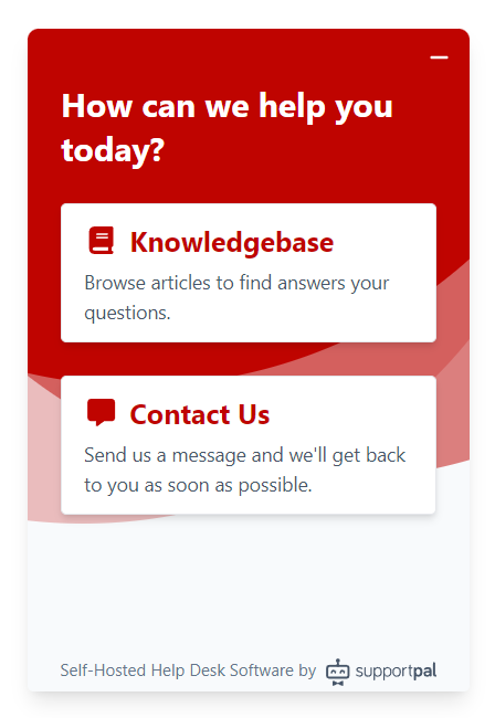
Help Widget
A JavaScript widget that developers can embed into their website to enable customers to easily search a knowledgebase or contact the help desk without leaving the page they're viewing.
Activate or Deactivate Channel
The Help Widget channel is disabled by default and needs to be activated before use. To do this, go to Settings -> Tickets -> Channels and click the "Activate" link on the Help Widget channel row. The channel can be deactivated in the same way, instead this time by clicking the "Deactivate" link on the same row.
Settings
To configure the channel, go to Settings -> Tickets -> Channels and click the "Settings" link on the Help Widget channel row. The channel must already be activated beforehand.
It's possible to create and manage multiple configurations, in case you have multiple websites and need to show a different knowledgebase or use a different colour scheme on each. Start by clicking 'Add Widget'.
Configure (Functionality)
- Name - If you wish to save the widget configuration, you must give it a name.
- Brand - Select the brand for which the widget will be for.
- Pages - Select what should be shown in the widget. It can either just be a list of articles with a search (Knowledgebase), a contact form to open a ticket simply (Contact Us), or both.
- Knowledgebase - Select the type from which articles will be displayed from.
- Department - Set if you wish to force all tickets to be opened in a specific department. Leave blank to give the user an option of public departments to select from.
- Subject - The subject that will be used for all tickets opened via the widget, leave blank to allow the user to set their own subject.
- Default Priority - Please select the priority to be set on all tickets opened via the widget.
Customise (Look & Feel)
All the customisation options are optional.
- Type - The type of widget, can choose from a small popup window or a sidebar that covers the whole height of the page, defaults to 'popup'.
- Position - If the button and widget should appear on the left or right side of the page, defaults to 'right'.
- Colour - The main colour scheme for the widget.
- Button Icon - The icon to be displayed in the widget button, can also be set to none.
Translations
If you make use of the multilingual functionality, you can define translations for the strings used in the widget. The language is automatically detected based on the user's browser.
Browser Support
The web widget is supported by the following browsers:
| Device Type | Browsers |
|---|---|
| Desktop |
|
| Mobile |
|
Using the Widget
Once you have set up a valid configuration, click the preview button at the bottom to see your code in action. You will need to re-do the preview any time you change any configuration, customisation or translation option.
At the end of the page you will find the code that will need to placed on your website to show the widget. It should be placed towards the end of your HTML code, just above </body>. Be sure to only copy the code once you've made all desired changes to your configuration as the code updates on changing most values.
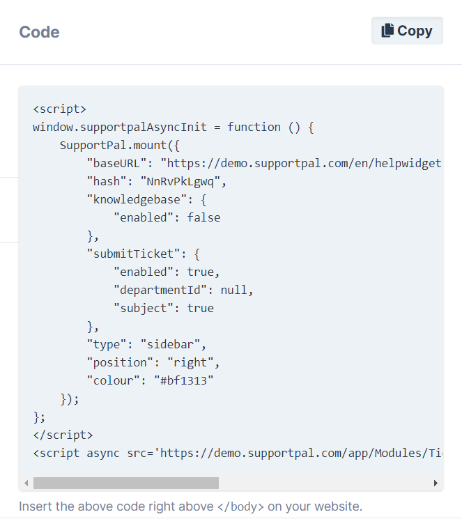
Note, the widget configuration must be saved before using the code.
Manually Editing Configuration
The Javascript code provided by our widget management tool can be modified if needed, for example to automatically set a name and email on the contact form. Below is our full default configuration file.
{
  /*
    |--------------------------------------------------------------------------
    | Widget Position
    |--------------------------------------------------------------------------
    |
    | The type of widget when opened. Valid values are: popup or sidebar.
    |
    */
  type: "popup",

  /*
    |--------------------------------------------------------------------------
    | Widget Position
    |--------------------------------------------------------------------------
    |
    | Where to display the widget on the page. Valid values are: left or right.
    |
    */
  position: "right",

  /*
    |--------------------------------------------------------------------------
    | Colour Scheme
    |--------------------------------------------------------------------------
    |
    | A valid CSS color value (hex, rgb, hsl, keyword) used to style the
    | non white portions of the widget.
    |
    */
  colour: "#06548C",

  /*
    |--------------------------------------------------------------------------
    | Button Icon
    |--------------------------------------------------------------------------
    |
    | The icon to use in the button. Valid values are: none, lifebuoy, envelope
    | or bubble2.
    |
    */
  buttonIcon: "envelope",

  /*
    |--------------------------------------------------------------------------
    | SupportPal base URL.
    |--------------------------------------------------------------------------
    |
    | Base URL of SupportPal installation.
    |
    */
  baseURL: null,

  /*
    |--------------------------------------------------------------------------
    | Submit Ticket
    |--------------------------------------------------------------------------
    |
    | The department that tickets should be created in. If departmentId is null
    | a dropdown menu will allow the user to select a department. The defaults
    | can be set to automatically fill in data on the contact form.
    |
    */
  submitTicket: {
    enabled: true,
    departmentId: null,
    subject: true,
    defaults: {
      name: "",
      email: "",
      subject: "",
      message: "",
    },
  },

  /*
    |--------------------------------------------------------------------------
    | Knowledgebase
    |--------------------------------------------------------------------------
    |
    | The knowledge base to search for articles.
    |
    */
  knowledgebase: {
    enabled: false,
    typeId: null,
    defaultSearchTerm: "",
  },

  /*
    |--------------------------------------------------------------------------
    | Messages
    |--------------------------------------------------------------------------
    |
    | The strings used throughout the widget. Can be used to add other locales,
    | additional locales must conform to BCP 47 using ISO_639-1 locale code and
    | an optional ISO_3166-1 ALPHA-2 regional identifier. For example, valid
    | identifiers are: 'en', 'fr', 'en-GB', 'en-US'.
    |
    */
  messages: {
    en: {
      dock_text: "Help",
      widget_title: "How can we help you today?",
      search: "Search",
      no_results: "No search results. Try searching for something else.",
      knowledgebase: "Knowledgebase",
      knowledgebase_desc: "Browse articles to find answers your questions.",
      contact_us: "Contact Us",
      contact_us_desc:
        "Send us a message and we'll get back to you as soon as possible.",
      department: "Department",
      name: "Name",
      email: "Email",
      subject: "Subject",
      message: "Message",
      attach_files: "Attach Files",
      send: "Send",
      contact_success:
        "Thank you, your message has been received and we will reply soon.",
      attachment_extension_not_allowed:
        "Unable to attach file, file extension not allowed.",
      something_went_wrong:
        "We're sorry, something went wrong. The service may be temporarily unavailable. Please try again later.",
      required: "The :attribute field is required.",
      invalid: "The :attribute field is invalid.",
    },
  },
};
Example
Setting a name and email address in the contact form automatically. We need to add the defaults object to the submitTicket configuration.
    <script>
        window.supportpalAsyncInit = function () {
            SupportPal.mount({
                ...
                "submitTicket": {
                    "enabled": true,
                    "departmentId": null,
                    "subject": true,
                    "defaults": {
                        "name": "John Doe",
                        "email": "john@doe.com"
                    }
                },
                ...
            });
        };
    </script>
Javascript API
A simple Javascript API has been made available to provide functions to modify the button and widget.
| Function | Description |
|---|---|
setLocale |
Set the locale to load the widget in, overrides the default behaviour of detecting the locale from the user's browser. |
setOffsetHorizontal |
Set the horizontal offset of the button and widget (popup only) from the left or right (based on settings) the browser screen. |
setOffsetVertical |
Set the vertical offset of the button and widget (popup only) from the bottom the browser screen. |
setDefaultSearchTerm |
Set the default search term for when the knowledgebase is loaded. |
toggle |
Open or close the widget depending on its current state. |
setLocale
Set the locale to load the widget in, overrides the default behaviour of detecting the locale from the user's browser.
Parameters
locale |
The locale string to load, e.g. 'fr' or 'en_US'. |
Example
    <script>
        window.supportpalAsyncInit = function () {
            SupportPal.mount({
                ...
            });
            SupportPal.on('ready', function (el) {
                el.setLocale('fr');
            });
        };
    </script>
setOffsetHorizontal
Set the horizontal offset of the button and widget (popup only) from the left or right (based on settings) the browser screen.
Parameters
distance |
Distance from the left or right (based on settings) of the browser screen in pixels (integer). |
Example
    <script>
        window.supportpalAsyncInit = function () {
            SupportPal.mount({
                ...
            });
            SupportPal.on('ready', function (el) {
                el.getVueInstance().setOffsetHorizontal(40);
            });
        };
    </script>
setOffsetVertical
Set the vertical offset of the button and widget (popup only) from the bottom the browser screen.
Parameters
distance |
Distance from the bottom of the browser screen in pixels (integer). |
Example
    <script>
        window.supportpalAsyncInit = function () {
            SupportPal.mount({
                ...
            });
            SupportPal.on('ready', function (el) {
                el.getVueInstance().setOffsetVertical(40);
            });
        };
    </script>
setDefaultSearchTerm
Set the default search term for when the knowledgebase is loaded.
Parameters
term |
The term to use for the search. |
Example
    <script>
        window.supportpalAsyncInit = function () {
            SupportPal.mount({
                ...
            });
            SupportPal.on('ready', function (el) {
                el.setSearchTerm('email');
            });
        };
    </script>
toggle
Open or close the widget depending on its current state.
Example
    <script>
        window.supportpalAsyncInit = function () {
            SupportPal.mount({
                ...
            });
            SupportPal.on('ready', function (el) {
                el.getVueInstance().toggle();
            });
        };
    </script>