Chat
The Chat channel is a real-time messaging widget that can be embedded into your website, enabling customers to start conversations with support agents or AI assistants without leaving the page they are viewing.
Unlike traditional live chat, the Chat channel is designed as an asynchronous messaging experience. Conversations persist over time, allowing customers to leave and return at their convenience while maintaining the full conversation history.
Activate or Deactivate Channel
The Chat channel is disabled by default and needs to be activated before use. To do this, go to Settings → Tickets → Channels and click the "Activate" link on the Chat channel row. The channel can be deactivated in the same way by clicking the "Deactivate" link on the same row.
Settings
To configure the channel, go to Settings → Tickets → Channels and click the "Settings" link on the Chat channel row. The channel must be activated beforehand.
It's possible to create and manage multiple widget configurations, in case you have multiple websites and need to present different conversation options or use a different colour scheme on each. Start by clicking 'Add Widget'.
General
The General tab controls the content displayed on the widget dashboard — the first screen a user sees when they open the widget.
Name
Give the widget configuration a name to identify it from other configurations (e.g. "Website" or "Help Centre").
Dashboard
Configure the items that appear on the chat widget dashboard.
-
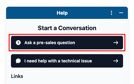
Conversations - Create one or more buttons that allow users to start a chat with a specific
department. Buttons can be reordered by drag and drop. To add a new button, click
+ Add Start Conversation Button. Each button has the following fields:
- Icon - The icon displayed on the conversation button, uses the FontAwesome library. You can search for an icon from the default list or enter a custom icon name.
- Name - The label shown on the conversation button (e.g. "Ask a pre-sales question"). Supports translations via the translate icon.
- Department - The department that conversations started via this button will be assigned to (e.g. "Sales").
- Priority - The priority level assigned to conversations started via this button (e.g. "Low", "Normal", "High").
- Opening Message - An optional greeting message shown to the user when they open this conversation. Supports translations via the translate icon.
- AI Responses - When enabled, an AI agent will automatically respond to user conversations, with automatic escalation to a human agent when appropriate. Requires the AI Assistant plugin to be activated and configured.
-
Self-Service - Add links to browse articles in the self-service portal. Entries can be reordered by drag and drop.
Each entry requires a type (e.g. a knowledgebase category) and a display name.
To add a new entry, click + Add Self-Service Link. -
External URLs - Add links to external websites or resources. Entries can be reordered by drag and drop.
Each entry requires an icon, a display name, and a URL. The icon field supports any font-awesome icon. Clear the default value to search for any icon within their library.
To add a new entry, click + Add External Link.
The order of the items in each section can be adjusted by clicking and holding on the three vertical lines on the left and dropping them in the desired order.
Appearance
The Appearance tab controls the look and feel of the widget. All options are optional and fall back to sensible defaults.
-
Type - The type of widget when opened.
Choose either a small Popup window or a Sidebar that covers the full height of the page. Defaults to Popup. - Position - Whether the button and widget appear on the left or right side of the page. Defaults to Right.
-
Colour - The main colour scheme used throughout the widget, specified as a hex value
(e.g.
#06548c). - Button Icon - The icon displayed in the floating widget button, uses the FontAwesome library. You can select an icon from the default list or clear the default value to search for any icon in the font-awesome library. Can also be set to none.
- Button Text - The text label displayed in the floating widget button (e.g. "Help"). Can be set to an empty string to show the icon only. Translations are supported via the translate icon.
- Template Mode - Controls the light/dark theme of the widget. Choose System to automatically synchronise with the user's operating system theme setting, or explicitly set Light or Dark.
Security
The Security tab provides options to restrict and authenticate users who interact with the chat widget.
- Secret Key - A server-side secret used when generating an HMAC hash for user authentication. This key should never be exposed publicly. Initially the key can only be generated on an existing widget, and the value will only be shown once, it can be regenerated later if needed.
- Require Authentication - When enabled, users will be required to provide their name and email address before they can start a chat session. This ensures all conversations are linked to an identifiable contact.
Translations
Every string used in the widget can be customised here. The default locale is English — you can edit the English phrases directly if you wish to change the default wording, or add translations for additional locales (such as Spanish) alongside the English values. The language is automatically detected based on the user's browser.
:term) represents a variable placeholder and should not be translated.
Notifications
The Notifications tab controls which email templates are used for chat-related notifications. Email templates can be modified or created by going to Settings → General → Email Templates.
- Operators — Reply Notification - The email template sent to operators when a user starts a new chat conversation or replies to an existing one. Only unread messages are included.
- Users — Reply Notification - The email template sent to users when an operator replies to a chat conversation. Only unread messages are included.
- Users — Transcript - The email template sent to users when they request a transcript of their chat conversation.
Embed Code
The Embed Code tab displays the snippet that needs to be placed on your website to show the chat widget.
It should be inserted towards the end of your HTML, just above </body>. Click the Copy
button to copy the snippet to your clipboard.
Preview
A live preview of the widget is displayed in the right-hand panel of the Edit Widget page. The preview updates automatically as configuration options are changed, allowing you to verify the appearance before embedding the widget on your site.
Browser Support
The chat widget is supported by the following browsers:
| Device Type | Browsers |
|---|---|
| Desktop |
|
| Mobile |
|
Using the Widget
Once the configuration has been saved and the embed code added to your website, visitors will see the chat button in the corner of every page. Clicking the button opens the widget.
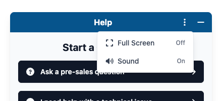
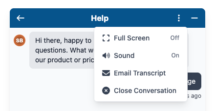
The widget header contains a three-dot menu with global options available on every screen:
- Full Screen - Expands the widget to fill the entire browser window, giving more space for reading and composing messages. Toggling it off restores the standard popup or sidebar size.
- Sound - When enabled, a bell sound plays each time a new message is received in a conversation.
The widget can also be manually resized by clicking and dragging its edges. Resizing is only available on the sides of the widget that are not anchored to the edge of the page.
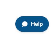
Dashboard
The widget dashboard presents the configured conversation options, self-service links, and external URLs, as well as a list of the user's previous conversations. The self-service links and external URLs are simple hyperlinks that open the target website in a new browser tab, while the conversation options allow users to start a new chat.
The Your Conversations section lists all previous conversations for the current user. Conversations with unread messages are shown in bold and marked with an unread indicator, making it easy to see at a glance which conversations need attention.
Starting a Conversation
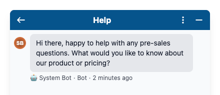
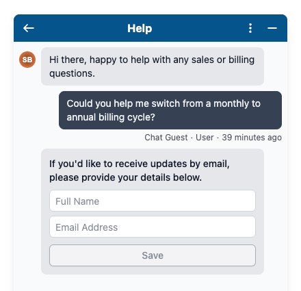
Users start a new conversation by clicking one of the Start a Conversation buttons on the dashboard.
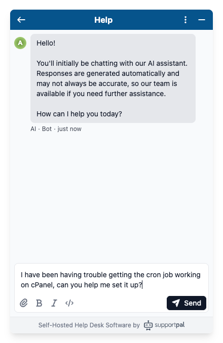
When a conversation is opened, the first message displayed is the Opening Message configured for that button. If no opening message has been set, the conversation area will be empty until the user sends their first message.
The message editor supports rich text formatting (bold, italic, and inline code) and file attachments.
Authentication
Require Authentication Enabled
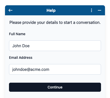
If Require Authentication is enabled in the Security settings, clicking a conversation button will first present the user with an authentication screen before the conversation is opened. The user is asked to provide their Full Name and Email Address, then click Continue.
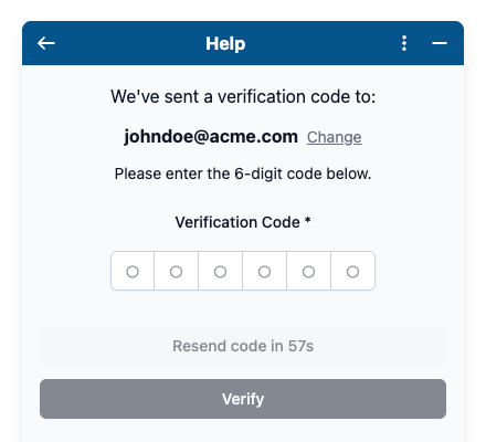
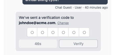
A 6-digit verification code is sent to the email address provided, which the user must enter to confirm their identity. Once verified, the conversation screen is shown as normal. If the code does not arrive, a Resend code button becomes available after a short delay, and the user can also click Change to correct their email address if needed.
Require Authentication Disabled
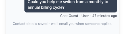
When authentication is not required, no identity screen is shown before the conversation. Instead, once the user sends their first message, the widget prompts them to optionally provide a Full Name and Email Address. This allows the system to notify them by email if a reply arrives after they have left the page - appropriate behaviour for a messaging service where responses may not be immediate.
If the user is already registered at the help desk, a 6-digit verification code is sent to the email address provided, which the user must enter to save their contact details.
Once the contact details have been saved, this will show in the widget.
Manually Authenticating a User
If the widget is embedded on an authenticated area of your website, you can automatically authenticate users when they open the widget. This creates a seamless experience by eliminating the need for users to enter their name and email address before starting a conversation.
Before you can use this feature, you must generate the secret key in the widget settings. The secret key is used to securely verify the user's identity and generate the authentication hash required.
The details must be set under the userDetails section in the widget initialisation code. The
email and emailHash are required to authenticate the user.
window.supportpalAsyncInit = function () {
    SupportPal.init({
        baseURL: "https://support.domain.com/en/chat",
        hash: "vIbuXmgqfh",
        userDetails: {
            email: "...",
            emailHash: "...",
            // Optionally set the user's name in case it's a new user.
            firstname: "John",
            lastname: "Doe",
        }
    });
};
The emailHash is a JWT (JSON Web Token) with the email in the payload and encoded by the secret key.
Below is an example of generating a JWT using the
Firebase PHP library.
Only email is required in the JWT payload, we recommend also including iat (issued at) and
exp (expiration time) as additional claims in the payload.
$payload = [
    'email' => $email,
    'iat'   => now()->getTimestamp(),
    'exp'   => now()->addMinutes(15)->getTimestamp(),
];

$hash = JWT::encode($payload, $secretKey, 'HS256');
Make sure to generate this hash on the backend of your website, to not reveal the secret key on the frontend.
If the email hash is valid, they will be automatically authenticated when they open the widget.
Conversation Options
Once a conversation has been started, additional options become available in the three-dot menu:
- Email Transcript - Generates a full transcript of the conversation and sends it to the user's email address. The transcript is delivered by email and may take a few minutes to arrive.
- Close Conversation - Marks the conversation as closed when the query has been resolved.
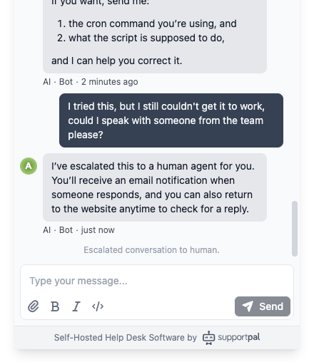
AI Responses
When AI Responses are enabled for a conversation button, an AI agent will automatically reply to incoming user messages.
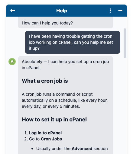
Conversations being handled by the AI will have the AI operator account assigned to them. If the user shows dissatisfaction or asks to speak to a human, the AI will stop replying and unassign itself from the conversation, escalating it to a human agent.